Objectives: To understand the concepts underpinning the critical analysis of visual data
To increase awareness of the requirements of the Paper 2 infographic exam question
To increase awareness of the requirements of the Paper 2 infographic exam question
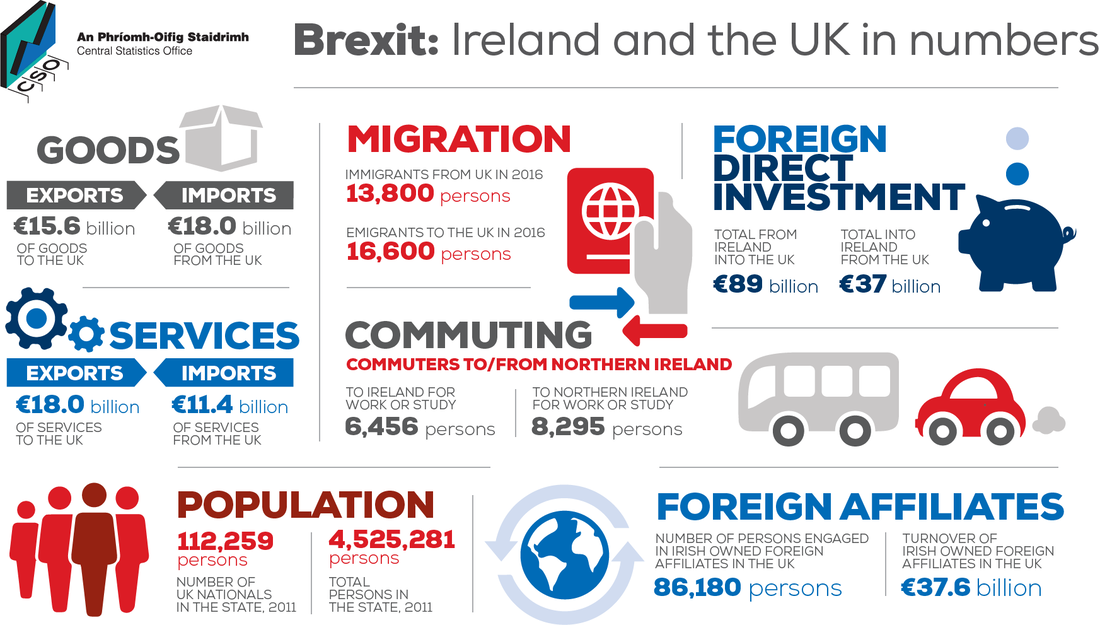
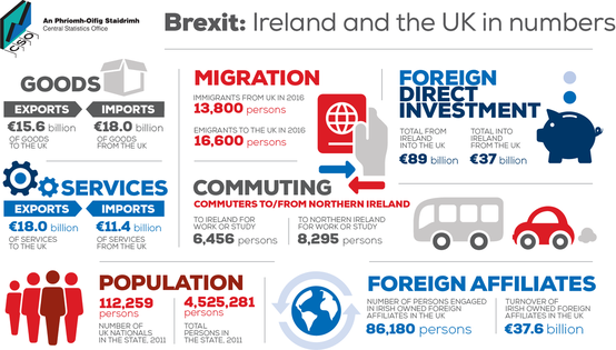
Study the Brexit infographic above and see if you can offer an answer to these questions.
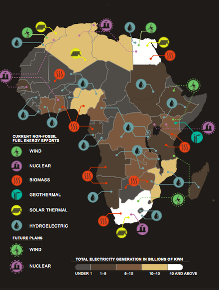
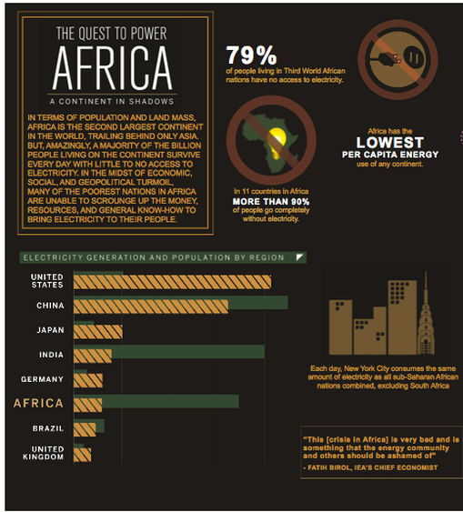
1. How many people commute to Northern Ireland for work or study?
2. Suggest one limitation of the commuting data given in the infographic.
3. Using evidence from the infographic, suggest why the infographic might be seen as anti-Brexit?
1. How many people commute to Northern Ireland for work or study?
2. Suggest one limitation of the commuting data given in the infographic.
3. Using evidence from the infographic, suggest why the infographic might be seen as anti-Brexit?
We will come back to your thinking at the end of the lesson.
Why infographics?
The IBO values critical thinking; skills of source analysis and recognising different perspectives has become a core skill. Infographics are the chosen medium with which to engage with and examine these skills.
Why critical thinking?
In a world full of complex information, fake news and a global media controlled by just a hand-full of individuals, the ability to understand and see behind the headlines, information, data and agenda of the producer is as crucial as ever.
In some ways, the infographics question is a variation on the concept of analysing a source using OPCVL: origin, purpose, content, value, limitation.
In other words, who created the source, where and when? For what purpose was the source created? What is being said and, crucially, what is not being said? Why might the source be useful in understanding a particular issue? Why might care be needed in its use? What is the agenda behind the source, the information given and the way it is communicated? How does it alter the viewers perspective and understanding of the issue discussed?
|
Trump claims Mueller report finds 'complete and total exoneration'
|
Don't say Trump is exonerated. It's too soon for that
|
|
|
The fact Mueller failed to bring charges does not mean he failed to find evidence of highly disturbing conduct. The bottom line is this: even if the Mueller report contained only the facts that are publicly known so far, it would have been grounds for impeachment in saner political times. And it likely contains much more. Given this, the administration’s continued attacks on the media for reporting what we all saw with our own eyes is designed to obfuscate what is already known and inoculate the public against what is to come. It would behoove true defenders of the rule of law and a free press not to make their job any easier. Richard Wolffe, Guardian columnist. |
Two very different interpretations of the same source, the Mueller investigation into Trump's dealings.
Recognising perspective is now a key component within the mark scheme:
AO3 - analysis and conclusion are justified through well-developed evaluation of evidence and perspectives.
Think of one value and one limitation of the two sources. Think in terms of who, what, why, where, when, how?
What the examiner wants to see is your ability to understand and critically analyse the infographic:
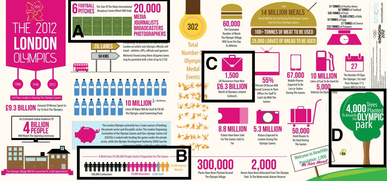
Let's try this one. In pairs, using the analytical concepts that we have just discussed, comment upon the highlighted areas A, B, C and D, showing ways in which you can add analytical value and critical thinking to the choice of data, image, method of communication, language, content, etc, used in the infographic.
Any explained and justified observations are acceptable.
Adding geographical context is also of benefit.
- can you find data within the graphic
- can you identify assumptions and generalisations
- can you understand the underlying agenda of the message
- can you identify effective communication techniques
- can you identify limitations within the information given, in terms of data or in terms of communication, for example.
Let's try this one. In pairs, using the analytical concepts that we have just discussed, comment upon the highlighted areas A, B, C and D, showing ways in which you can add analytical value and critical thinking to the choice of data, image, method of communication, language, content, etc, used in the infographic.
Any explained and justified observations are acceptable.
Adding geographical context is also of benefit.
What is expected for the exam?
You will need to answer a dedicated infographic question worth 10 marks for Paper 2. It will be Section B.
Breaking down the marks available for the paper and the time given, you will have 15 minutes with which to do this.
You will need to answer a dedicated infographic question worth 10 marks for Paper 2. It will be Section B.
Breaking down the marks available for the paper and the time given, you will have 15 minutes with which to do this.


|
|
Suggest. Propose a solution, hypothesis or other possible answer.

|

|
Evaluate. Make an appraisal by weighing up the strengths and limitations.
So where are we now? Happier with what is expected? Before we review the starter infographic, would anybody like to reflect upon their learning and quickly add to or change their answers?
Further practice here.
Question 1
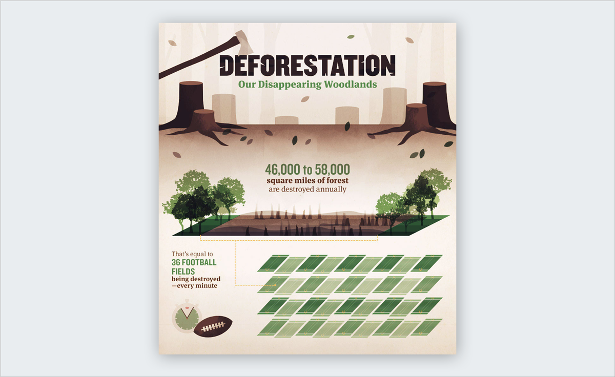
a) i How many football fields are destroyed each minute? (1)
ii What is the problem in using football fields as a measure of area for a global infographic? (1)
b) Suggest why the title might cause confusion and how it could be improved. (2)
c) Evaluate two ways in which the infographic might misrepresent the issues and problems of deforestation. (3 + 3)
Question 2
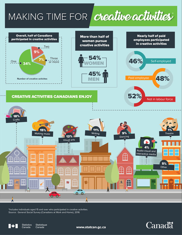
a) What percentage of Canadians:
i) enjoy making music. (1)
ii) participate in more than one creative activity. (1)
b) Suggest one way in which the data might be confusing for the viewer. (2)
c) Evaluate two ways in which the infographic may not represent the full range of Canadian society. (3 + 3)
a) What percentage of Canadians:
i) enjoy making music. (1)
ii) participate in more than one creative activity. (1)
b) Suggest one way in which the data might be confusing for the viewer. (2)
c) Evaluate two ways in which the infographic may not represent the full range of Canadian society. (3 + 3)
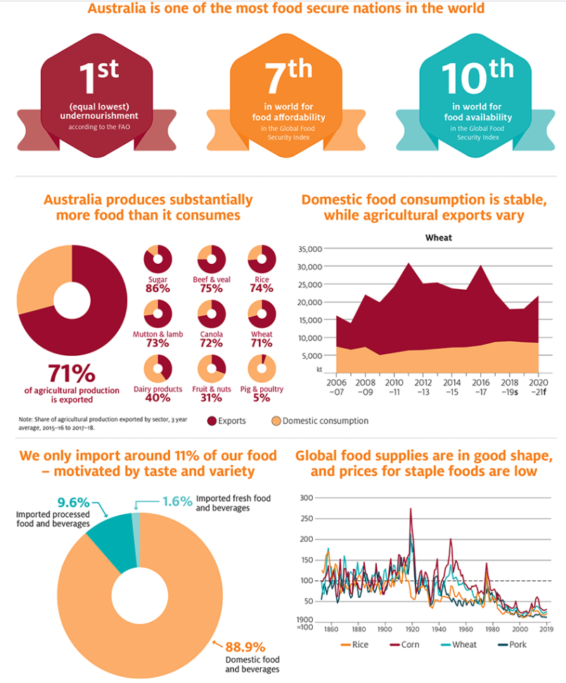
- State the percentage of ‘Mutton & Lamb’ that Australia produces that they then export. [1]
- State the precise percentage of Australia's food which is imported. [1]
- Suggest one alternative graphical method that could be used present the data in the ‘Domestic food consumption is stable while agricultural exports vary’ graph. [2]
- To what extent might this infographic make Australian citizens more at ease about food security than they should be? [6]
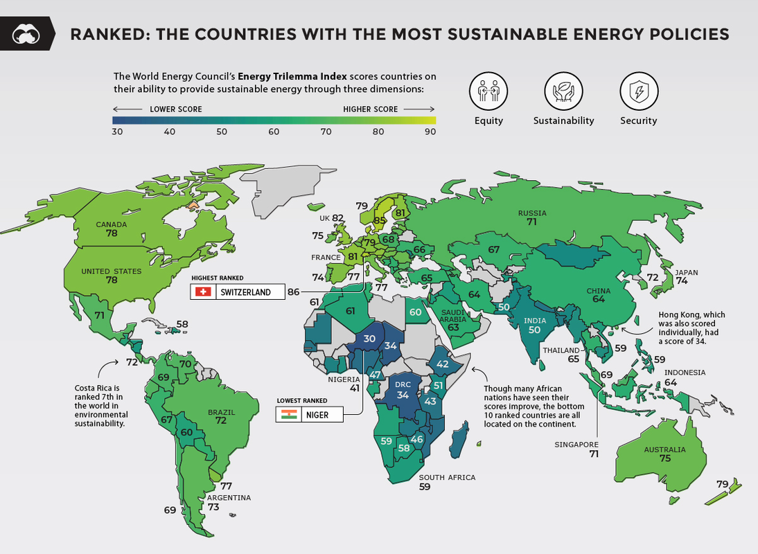
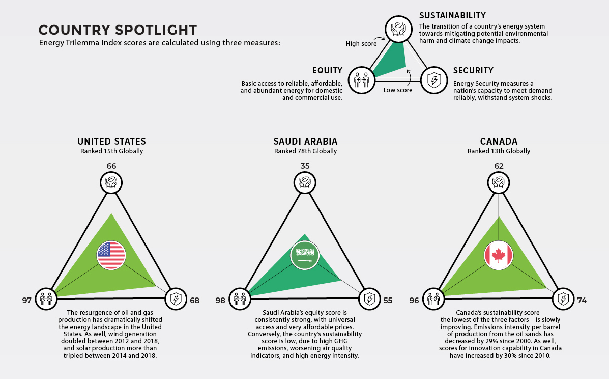
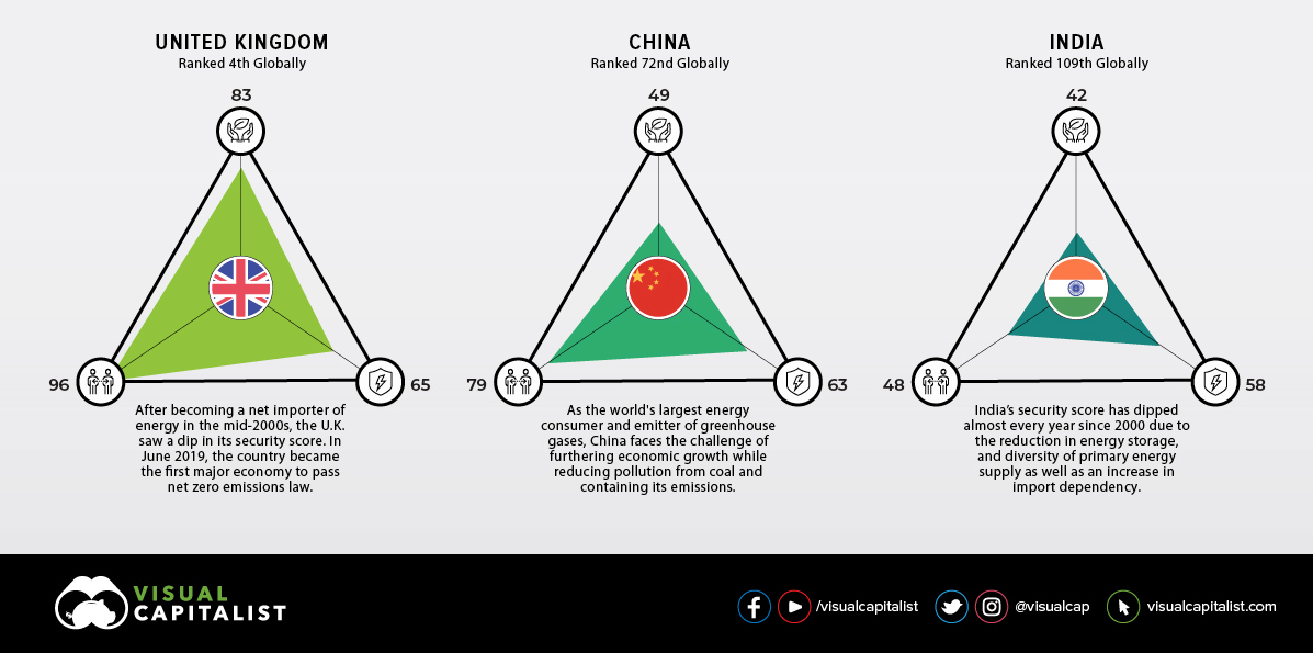
- What score on the Energy Trilemma Index does Switzerland get? [1]
- What score on the Energy Trilemma Index does India get? [1]
- Describe the distribution of countries that scored 76 or above [2]
- Evaluate how the relative sustainable energy policies are graphically represented in the infographic. [6]